A Net Analysis reports a holistic look at the effects resulting from a change in production or spending in the economy, both the positive and negative. Net Analyses that involve two different Sectors will have net winners and net losers beyond just the two directly impacted industries. It can be useful to examine these sides in an analysis and can help create a truer impact picture. It is easiest to do this when you create multiple Events and analyze them in the same Group.
Think about this example. When a new store opens up, local purchasing power doesn’t automatically increase to support it. Local residents and visitors are still likely to spend the same amount of their disposable income. These dollars must now, however, be split between more retail options. The new store will win in terms of selling goods, but the older stores will likely lose sales.
This is, of course, unless it can be argued that the new store is actually filling in “import substitution.” For example, if this was the first furniture store in the Region, people no longer have to leave to buy a bookshelf and therefore the money is no longer leaked out of the local economy.
DETAILS:
Let’s look at an example. Barlow Energy of South Carolina is looking to move $100M in production from fossil fuels to solar. So we will see a decrease in fossil fuels at the same time we see an increase in solar operations. We want to look at the Net Analysis; the overall change in the economy because of both of these Events.
To set this up, we create two Events in South Carolina: a negative $100M in Sector 42 – Electric power generation – Fossil fuel and a positive $100M in Sector 44 – Electric power generation – Solar.
When we run this analysis, the Results screen will default to show us the net effects on South Carolina resulting from the change from fossil fuels to solar power generation – the net effect of both Events. We see that the Direct Output is $0 because we had both a negative and a positive $100M impact.
We can also see that this change will see a loss of 14.5 Indirect jobs and $1,000,624.64 in Indirect Output. The Direct Effects, aside from Output, and Induced Effects all see increases; but why?
We can look at just the negative effects of the loss of fossil fuel power or just the positive effects of solar power by applying the Filter. If Barlow Energy wants to focus only on what jobs will be lost, we can Filter for our fossil fuels Event. Overall, this loss in $100M in fossil fuel energy would have a negative employment impact of 327.87 jobs. 79.65 of these jobs are Direct jobs lost from the Fossil fuel industry. 152.6 of these jobs are Indirect jobs. The remaining 95.61 jobs are Induced jobs.
We can see which Industries these negative job impacts are affecting by viewing the Detailed Employment Results. Notice we see the same negative Direct employment impact of 79.65 in the fossil fuel sector.
If, on the flip side, they only want to show job gains from the switch, Filter for only the solar event. Overall, this gain in $100M in solar energy would have a positive employment impact of 733.50 jobs. Sector 44 – Electric power generation – Solar will see a Direct Employment impact of 440.99 jobs. The Indirect Employment impact is 138.1 jobs, and the Induced Employment impact is 154.42 jobs.
We again, can dig into which industries these jobs impact by looking at the Detailed Employment Results.
As a net effect, the switch will have a negative Effect on Indirect Employment because the employment loss from fossil fuels supply chain is larger than the employment gain from the solar supply chain (-152.6+138.1 = -14.5).
The overall net change in jobs is 405.63 (733.50-327.87=405.63). We can therefore conclude that in South Carolina, investing in solar energy is better for overall employment than that of fossil fuel energy. Note that this might be a very different answer if we examined West Virginia where a significant amount of coal is mined or in New Hampshire were they have far fewer sunny days than South Carolina.
https://implan.com/wp-content/uploads/Market-site-Logo-resized-2-1.jpg00Adam Smithhttps://implan.com/wp-content/uploads/Market-site-Logo-resized-2-1.jpgAdam Smith2019-10-24 15:02:022019-10-24 15:02:14Net Analysis: Considering Both Sides of an Impact
The contents of this tutorial are outlined below. If you already know what you’re looking for, click on a link to advance to a specific section or STEP!
This tutorial is designed to walk you through the process of downloading your impact results from IMPLAN. The procedure begins and ends at the RESULTS screen (featured image).
Featured image: The RESULTS Screen
SOME BACKGROUND…
Below is a brief discussion about the process of downloading impact results from IMPLAN. To learn about the contents of the RESULTS screen, see Navigating the RESULTS Screen.
Who is this tutorial for?
This tutorial is for anybody who doesn’t know how to download the results of their IMPLAN study. Downloading results allows an analyst to export them for use outside of the tool. Follow THE STEPS herein to learn how to quickly and easily download your study’s results so you can start sharing its findings!
Why is this process important?
Downloading your impact results is a valuable step in the overall process of completing an impact analysis with IMPLAN because it allows you to use your study’s findings across other mediums and in collaboration with other analytical tools or platforms. In addition to IMPLAN, many analysts also call upon other tools throughout the course of their projects, applying or incorporating different ones at different stages of their overall efforts. So, in order for the valuable insights that IMPLAN offers to be most helpful during additional stages of your overall effort, knowing how to download your results is key.
Do I need anything before I can do this?
Yes. In order to have any impact results to download from IMPLAN, you’ll need to have completed a study first and foremost. That said, results from a completed study can be downloaded at any time, so the act itself isn’t time-sensitive. But, in order to carry out the specific process described in this tutorial, you’ll need to have already completed the impact study whose results you intend to download.
Will I need to do this often?
Well, that depends. This is another one of those processes in IMPLAN that you can carry out as frequently or as infrequently as you’d like! If you prefer to download your results every time you finish an impact study, you can. If you prefer to finish studies, walk away, and then download specific, especially-relevant data points from their collective results at a later time, you can do that also. IMPLAN is all about accommodating your needs, preferences, and work styles—that’s true even after your study’s finished.
THE STEPS
The procedure to download your results begins and ends at the RESULTS screen (see fig. 1). The instructions below include links to other user’s guide tutorials and/or articles which may prove helpful in the event that you encounter any roadblocks during the course of your analysis. If challenges persist, visit the ADDITIONAL RESOURCES section for a more extensive selection of supplementary material.
1. Select a tab.
At the RESULTS screen, select the tab (see fig. 1) along the top which holds the results you intend to download.
Fig. 1
2. Click “Settings”.
After selecting a tab, click the “Settings” button (see fig. 2), represented by a cogwheel icon in the upper right corner of the screen.
Fig. 2
Upon doing so, the “Settings” menu will open (see fig. 2.a).
Fig. 2.a
3. Click Download as PDF….
In the opened “Settings” menu, click Download as PDF… (see fig. 3).
Fig. 3
Upon doing so, the Download prompt (see fig. 3.a) will appear.
Fig. 3.a
4. Customize the filename.
In the Download prompt, click into the Filename field (see fig. 4) and modify the name of the file.
Fig. 4
5. Click Download.
After customizing the filename, click Download (see fig. 5).
Fig. 5
Upon doing so, a screen will appear in your browser (see fig. 5.a) which shows the status of your download.
Fig. 5.a
Once finished, the downloaded file will be located in the “Downloads” folder on your computer’s hard drive.
Fig. 5.b
Upon locating the file, you’ll have successfully downloaded your results!
END OF PROCEDURE
WHAT NEXT?
IMPLAN is designed to allow for analyses to be launched or resumed from multiple points of entry. So, you can choose to start or continue your studies from whichever stage best fits your needs—your process doesn’t have to be linear! However, if you’re brand new to IMPLAN and need some guidance, or would just prefer some professional advice, we’re happy to offer our suggestion about what to do next.
WHAT WOULD IMPLAN DO?
After downloading your results you’ll have completed an entire impact analysis with IMPLAN! Once you have, we suggest returning to the IMPLAN Dashboard in order to continue applying your newly-acquired analytical skills by beginning additional studies on your own!
Feel like it’s time to return to the IMPLAN Dashboard? Need a refresher? No problem! The resource below will reacquaint you with it.
https://implan.com/wp-content/uploads/Market-site-Logo-resized-2-1.jpg00Adam Smithhttps://implan.com/wp-content/uploads/Market-site-Logo-resized-2-1.jpgAdam Smith2019-10-24 14:58:402019-10-24 14:58:58How to Download Your Results
Indicates that you know what industry or industries are experiencing the change in production and you are interested in targeting those specific industries.
There are four different types of Industry Events:
Industry Output
Industry Employment
Industry Employee Compensation
Industry Proprietor Income
These four Industry Event Types represent each value that can be entered into a single Industry Event. Picking among the 4 types should be determined by which value you have available about the industry.
When more than 1 value is known, those additional values can be entered in the Advanced Menu.
Industry Contribution Analysis is a method used to estimate the value of a Sector or group of Sectors in a region, at their current levels of production, rather than estimating the value of a change. While the focus of the analysis still looks at backward linkages, the purpose of this analysis differs. When considering the Indirect and Induced Effects of an impact analysis, we are looking at how industries in our region will respond to a change in the key industry or industries being modeled in our Events. Contribution analysis shifts this framework to see what industries and what level of production in these industries is being supported by the current activity of the target Sector or Sectors in the region. Contribution Analysis is a unique method which affects a constraint upon the Model by removing feedback linkages or buy backs to the Industry being analyzed.
Find more information about Industry Contribution Analysis here to learn more and determine if an Industry Contribution Analysis Event is right for your study.
You would use if you knew there was a change in commodity demand or production but didn’t know what Industry or Institution (e.g., government) would meet the demand. For example, you know there will be an increased need for nursing home-care in the region because of an aging population, but you don’t know what the mix of private hospitals, nursing homes, and government hospitals will provide this need.
Total vs Marginal Revenue selection is available for Commodities that can be purchased via a wholesaler or retailer in the Advanced Menu, and will default to Total Revenue.
This Event type is appropriate if you’d like to model a change in labor payments isolated from Industry production- e.g. examining the impacts of a wage increase for current employees.
Total Labor Income should include all new labor payments in the Study Area- New income for all workers in the region even if they don’t live there (local workers and in-commuters), including their –
i. Payroll tax
ii. Personal tax
iii. Savings
Note: the model will automatically deduct in-commuting income, payroll tax, personal tax, savings, and imported goods and services. All payroll taxes stay in the location of the employment. That is, only commuters’ post-payroll-taxes-income is deducted.
With a Labor Income Event, you can specify whether the income is earned by wage and salary employees or sole proprietors (or some combination of the two) but you cannot specify the specific household income categories receiving the income— after deductions, the remaining income is distributed across all household income groups according to the household column totals in the SAM. At this point the income is applied to the income group specific multipliers.
This Event type is appropriate if you’d like to model changes in Household Income that are independent of production and payroll.
Total Income should include all new household income in the Study Area- New income for all residents in the region, including their –
i. Personal tax
ii. Savings
Note: the model will automatically deduct personal tax, savings, and imported goods and services. The model assumes payroll tax and in-commuting income has been excluded from your total income entry. Benefits should be included as household income in your entry.
The leftover amount after deductions is then applied to the multipliers. In this case, you can specify the particular household income group(s) receiving the income.
Industry Spending Pattern events are appropriate if you have the data required to build your own spending pattern for what your specific Industry purchases or when an Industry’s Output equation ratios need to be modified beyond the Event customization available in an Industry Event. This is highly useful for making an IMPLAN Sector more specific to your business/impact using Analysis-by-Parts.
WHERE THE EVENT VALUE IS APPLIED
DIRECT EFFECTS AND OMITTED DIRECT EFFECTS
https://implan.com/wp-content/uploads/Market-site-Logo-resized-2-1.jpg00Adam Smithhttps://implan.com/wp-content/uploads/Market-site-Logo-resized-2-1.jpgAdam Smith2019-10-24 14:56:312019-11-08 15:20:53Types of Events
The PROJECTS screen (featured image) is the organizational backbone of your long-term IMPLAN use. It’s where you can create new Projects in the tool from scratch, or access and edit saved Projects. This article is designed to a.) take you on a tour of the PROJECTS screen and b.) provide helpful information about its composition and function along the way.
Featured image: the PROJECTS screen
As you advance through this article, you’ll encounter links to other user’s guide articles and/or tutorials which may prove helpful in the event that you experience any complications during your analysis. If challenges persist, visit the ADDITIONAL RESOURCES section for a more extensive selection of supplementary content.
HOW TO GET THERE…
There is only one direct route by which to reach the PROJECTS screen: via the IMPLAN Dashboard. It cannot be reached directly from the REGIONS, IMPACTS, or RESULTS screen. However, the pathway to the RESULTS screen from each via the IMPLAN Dashboard is described below.
1. From the IMPLAN Dashboard
To reach the PROJECTS screen from the IMPLAN Dashboard, click PROJECTS (see fig. 1). To learn about the contents of the IMPLAN Dashboard, see Exploring the IMPLAN Dashboard.
Fig. 1
2. From the REGIONS screen
The RESULTS screen cannot be reached directly from the REGIONS screen. To reach it from the REGIONS screen, click the “Home” link (see fig. 2) in the left corner of the navigation bar and then advance to it from the IMPLAN Dashboard. To learn about the contents of the REGIONS screen, see Exploring the REGIONS Screen.
Fig. 2
3. From the IMPACTS screen
The RESULTS screen cannot be reached directly from the IMPACTS screen. To reach it from the IMPACTS screen, click the “Home” link (see fig. 3) in the left corner of the navigation bar and then advance to it from the IMPLAN Dashboard. To learn about the contents of the IMPACTS screen, see Exploring the IMPACTS Screen.
Fig. 3
4. From the RESULTS screen
The PROJECTS screen cannot be reached directly from the RESULTS screen. To reach it from the RESULTS screen, click the “Home” link (see fig. 4) in the left corner of the navigation bar and then advance to it from the IMPLAN Dashboard. To learn about the contents of the RESULTS screen, see Exploring the RESULTS Screen.
Fig. 4
COMPONENTS
The PROJECTS screen is comprised of two primary components: the All section and the Recent section. In addition to these, it also includes several elements which are common to multiple or all screens in the tool. The function and purpose of each are described below.
5. All
The All section (see fig. 5) is located on the lower half of the PROJECTS screen. It’s where every single Project you’ve ever saved in IMPLAN is stored and remains accessible to you. Saved Projects are displayed in a list with each individual Project represented by a separate entry in it.
Fig. 5
Each entry in the list communicates several high-level details (see fig. 5.a) of the specific Project it represents, including its Title, its Saved Project Files, the name of its creator, and the date it was last opened. The list is presented in chronological order according to the date that each Project was last opened.
Fig. 5.a
6. Recent
The Recent section (see fig. 6) is located on the upper half of the PROJECTS screen. It’s where a selection of saved Projects which have been accessed most recently are listed. Even when a Project becomes included in the Recent section, it will always remain in, and be accessible from, the All section.
Fig. 6
6.1 – Title
The Title header (see fig. 6.1) is located along the top of the PROJECTS screen. The name of each saved Project is displayed beneath it. The Title header and corresponding Project’s name displayed are merely labels and neither active links nor buttons. Clicking them results in no action.
Fig. 6.1
6.2 – Saved Project Files
The Saved Project Files header (see fig. 6.2) is located to the right of the Title header. Beneath it are three unlabeled icons which serve as links to the REGIONS screen, the IMPACTS screen, and the RESULTS screen.
Fig. 6.2
The map marker icon (see fig. 6.2.a) is the leftmost of the three icons. Clicking it brings you to the REGIONS screen. When visiting the REGIONS screen via a saved Project’s icon link, it’ll automatically display that Project’sRegion.
Fig. 6.2.a
The lightning bolt icon (see fig. 6.2.b) is the centermost of the three icons. Clicking it brings you to the IMPACTS screen. When visiting the IMPACTS screen via a saved Project’s icon link, it’ll automatically display that Project’sEvents and Groups.
Fig. 6.2.b
The pie chart icon (see fig. 6.2.c) is the rightmost of the three icons. Clicking it brings you to the RESULTS screen. When visiting the RESULTS screen via a saved Project’s icon link, it’ll automatically display that Project’s impact results.
Fig. 6.2.c
6.3 – Created by
The Created by header (see fig. 6.3) is located to the right of the Saved Project Files header. The name of each saved Project’s author is displayed beneath it. The Created by header and corresponding author’s name displayed are merely labels and neither active links nor buttons. Clicking them results in no action.
Fig. 6.3
6.4 – Last Opened
The Last Opened header (see fig. 6.4) is located the the right of the Created by header. The date upon which each saved Project was most recently accessed is displayed beneath it. The Last Opened header and corresponding date displayed are merely labels and neither active links nor buttons. Clicking them results in no action.
Fig. 6.4
6.5 – “Additional Options”
To make the large number of editable fields and customizable settings in IMPLAN easy to navigate, there are multiple unlabeled “Additional Options” menus scattered throughout the software. One of them is located on the far right side of each saved Project on the PROJECTS screen (see fig. 6.5).
Fig. 6.5
Clicking it automatically opens the menu (see fig. 6.5.a) and reveals its three options: Rename, Duplicate, and Remove. Clicking Rename lets you give that Project a new name in the tool. Clicking Duplicate creates an identical copy of that Project. Clicking Remove deletes that Project from the tool entirely and erases its listing from the PROJECTS screen.
Fig. 6.5.a
7. NEW PROJECT
The NEW PROJECT button (see fig. 7) is located in the upper right corner of the PROJECTS screen. Clicking it initiates the creation of brand new Project.
Fig. 7
8. “Home”
The “Home” link (see fig. 8) is an unlabeled element that appears on every screen in every screen in IMPLAN. It’s represented by an IMPLAN logo on the left side of the navigation bar along the top of each screen. Clicking it brings you to the IMPLAN Dashboard, unless you’re already at the IMPLAN Dashboard. Clicking it from the IMPLAN Dashboard results in no action.
Fig. 8
9. The screen name
The name of the screen (see fig. 9) appears in the navigation bar along the top of the PROJECTS screen. It’s located to the right of the “Home” link and says “PROJECTS”. The screen name is merely a label and is neither an active link nor button. Clicking it results in no action.
Fig. 9
10. “Profile”
The “Profile” button (see fig. 10) is an unlabeled element that appears on every screen in IMPLAN. It’s represented by your own name and a customizable thumbnail image on the right side of the navigation bar along the top of each screen.
Fig. 10
Clicking it reveals the Sign Out button (see fig. 10.a), which lets you exit the tool.
Fig. 10.a
That completes the tour of the PROJECTS screen!
END OF COMPONENTS
WHAT NEXT?
IMPLAN is designed to allow for analyses to be launched or resumed from multiple points of entry. So, you can choose to start or continue your studies from whichever stage best fits your needs—your process doesn’t have to be linear! However, if you’re brand new to IMPLAN and need some guidance, or would just prefer some professional advice, we’re happy to offer our suggestion about what to do next.
WHAT WOULD IMPLAN DO?
Once you’re familiar with the PROJECTS screen, you’ll have visited every screen in IMPLAN. At this stage, the only thing left to do will be to put them all together and start performing your own real-life analyses! To get started, we suggest returning to the IMPLAN Dashboard and officially beginning your analysis from there. Given that the IMPLAN Dashboard serves as the primary “hub” from which most studies are launched in the tool, it’s the perfect place to start!
The RESULTS screen (featured image) is one of the most informative screens in IMPLAN. It’s where the comprehensive and exhaustive results of your impact analysis can be accessed, browsed, reviewed, and downloaded for use outside of the tool. This article is designed to a.) take you on a tour of the RESULTS screen and b.) provide helpful information about its composition and function along the way.
Featured image: the RESULTS screen
As you advance through this article, you’ll encounter links to other user’s guide articles and/or tutorials which may prove helpful in the event that you experience any complications during your analysis. If challenges persist, visit the ADDITIONAL RESOURCES section for a more extensive selection of supplementary material.
HOW TO GET THERE…
The most common route to the RESULTS screen is via the PROJECTS screen. However, you may also reach it from the REGIONS or IMPACTS screen at various times throughout the course of your analysis. The details of each pathway to the RESULTS screen are described below.
1. From the IMPLAN Dashboard
The RESULTS screen cannot be reached directly from the IMPLAN Dashboard. To reach it from the IMPLAN Dashboard, click PROJECTS (see fig. 1) and then advance to it from the PROJECTS screen. To learn about the contents of the IMPLAN Dashboard, see Exploring the IMPLAN Dashboard.
Fig. 1
2. From the REGIONS screen
If you’re working inside a Project in IMPLAN, then to reach the RESULTS screen from the REGIONS screen, click RESULTS (see fig. 2) in the navigation bar along the top of it. To learn about the contents of the REGIONS screen, see Exploring the REGIONS Screen.
Fig. 2
3. From the IMPACTS screen
If you’re working inside a Project in IMPLAN, then to reach the RESULTS screen from the IMPACTS screen, click IMPACTS (see fig. 3) in the navigation bar along the top of it. To learn about the contents of the IMPACTS Screen, see Exploring the IMPACTS Screen.
Fig. 3
4. From the PROJECTS screen
To reach the RESULTS screen from the PROJECTS screen, click the pie chart icon (see fig. 4) in a given Project’s listing.
Fig. 4
Doing so will enter into the given Project (see fig. 4.a) and display its impact results upon arriving at the RESULTS screen. To learn about the contents of the PROJECTS screen, see Exploring the PROJECTS Screen.
Fig. 4.a
COMPONENTS
The RESULTS screen is comprised of five primary components: the Summary tab, the Output tab, the Employment tab, the Value Added tab, and the Tax Results tab. In addition to these, it also includes several elements which are common to multiple or all screens in the tool. The function and purpose of each are described below.
5. Summary
The Summary tab (see fig. 5) is located in the upper left corner of the RESULTS screen. It presents a high-level overview of your study’s impact results using tables, graphs, and diagrams. These items reveal your study’s Direct, Indirect, Induced, and Total Impacts with respect to various economic indicators, as well as some of the most significantly affected industries throughout your study’s Region. Some tables, graphs, and diagrams in the Summary tab also appear in the contents of other tabs on the RESULTS screen.
Fig. 5
5.1 – Economic Indicators by Impact
The Economic Indicators by Impacts table (see fig. 5.1) is the first item in the Summary tab on the RESULTS screen. It presents the Direct, Indirect, Induced, and Total Impact of your study’s real-life impact throughout its Region with respect to employment, labor income, value added, and output, in tabular form.
Fig. 5.1
5.2 – Top 5 Value Added Industries by Absolute Value
The Top 5 Value Added Industries by Absolute Value bar graph (see fig. 5.2) is the second item in the Summary tab on the RESULTS screen. It presents the Direct, Indirect, Induced, and Total Impact to the five most affected industries throughout your study’s Region with respect to value added.
Fig. 5.2
The key (see fig. 5.2.a) at the bottom of the graph clarifies which bars and colors in the body of it represent which of the different impact types.
Fig. 5.2.a
5.3 – Top 5 Output Industries by Absolute Value of Impact
The Top 5 Output Industries by Absolute Value of Impact bar graph (see fig. 5.3) is the third item in the Summary tab on the RESULTS screen. It presents the Direct, Indirect, Induced, and Total Impact to the five most affected industries throughout your study’s Region with respect to output.
Fig. 5.3
The key (see fig. 5.3.a) at the bottom of the graph clarifies which bars and colors in the body of it represent which of the different impact types.
Fig. 5.3.a
5.4 – Top 5 Employment Industries by Impact Absolute Value
The Top 5 Employment Industries by Impact Absolute Value bar graph (see fig. 5.4) is the fourth item in the Summary tab on the RESULTS screen. It presents the Direct, Indirect, Induced, and Total Impact to the five most affected industries throughout your study’s Region with respect to employment.
Fig. 5.4
The key (see fig. 5.4.a) at the bottom of the graph clarifies which bars and colors in the body of it represent which of the different impact types.
Fig. 5.4.a
5.5 – Top 15 Industries by Estimated Growth Percentage
The Top 15 Industries by Estimated Growth Percentage scatterplot diagram (see fig. 5.5) is the fifth item in the Summary tab on the RESULTS screen. It presents the fifteen industries throughout your study’s Region which are a.) expected to experience the most growth with respect to output, and b.) the percentage by which they’re expected to grow.
Fig. 5.5
The key (see fig. 5.5.a) at the bottom of the diagram clarifies which impact type the coordinates in the body of it represent.
Fig. 5.5.a
5.6 – Industries by Estimated Growth Percentage
The Industries by Estimated Growth Percentage table (see fig. 5.6) is the sixth item in the Summary tab on the RESULTS screen. It presents the total output, the impact output, and the percent of estimated growth of every industry throughout your study’s Region, in tabular form.
Fig. 5.6
5.7 – FILTERS
The FILTERS menu (see fig. 5.7) is a dropdown menu located at the top of each of the five tabs on the RESULTS screen. It’s where you can sort, highlight, or hide specific aspects of your study’s impact results in order to retrieve and review desired information more quickly and efficiently.
Fig. 5.7
Clicking the chevron opens the menu (see fig. 5.7.a) and reveals its eight available filters: Run ID, Dollar Year, Model Year, Analysis ID, Region, Impact, Group Name, and Event Name.
Fig. 5.7.a
Clicking into any of the editable fields (see fig. 5.7.b) on the menu allows you to edit its contents.
Fig. 5.7.b
6. Output
The Output tab (see fig. 6) is located to the right of the Summary tab at the top of the RESULTS screen. Like the Summary tab, it presents your study’s impact results using tables, graphs, and diagrams. Unlike the Summary tab, it delves specifically into those results as they pertain to output throughout your study’s Region.
Fig. 6
6.1 – Top 15 Output Industries by Impact
The Top 15 Output Industries by Impact bar graph (see fig. 6.1) is the first item in the Output tab on the RESULTS screen. It presents the Direct, Indirect, Induced, and Total Impact to the fifteen most affected industries throughout your study’s Region with respect to output.
Fig. 6.1
The key (see fig. 6.1.a) at the bottom of the graph clarifies which bars and colors in the body of it represent which of the different impact types.
6.1.a
6.2 – Industries by Impact
The Industries by Impact table (see fig. 6.2) is the second item in the Output tab on the RESULTS screen. It presents the Direct, Indirect, Induced, and Total Impact to every industry throughout your study’s Region with respect to output, in tabular form.
Fig. 6.2
6.3 – Top 15 Industries by Estimated Growth Percentage
The Top 15 Industries by Estimated Growth Percentage scatterplot diagram (see fig. 6.3) is the third item in the Output tab on the RESULTS screen. It presents the fifteen industries throughout your study’s Region which are a.) expected to experience the most growth with respect to output, and b.) the percentage by which they’re expected to grow.
Fig. 6.3
The key (see fig. 6.3.a) at the bottom of the diagram clarifies which impact type the coordinates in the body of it represent.
Fig. 6.3.a
6.4 – Industries by Estimated Growth Percentage
The Industries by Estimated Growth Percentage table (see fig. 6.4) is the fourth item in the Output tab on the RESULTS screen. It presents the total output, the impact output, and the percent of estimated growth of every industry throughout your study’s Region, in tabular form.
Fig. 6.4
6.5 – FILTERS
The FILTERS menu (see fig. 6.5) is a dropdown menu located at the top of each of the five tabs on the RESULTS screen. It’s where you can sort, highlight, or hide specific aspects of your study’s impact results in order to retrieve and review desired information more quickly and efficiently.
Fig. 6.5
Clicking the chevron opens the menu (see fig. 6.5.a) and reveals its eight available filters: Run ID, Dollar Year, Model Year, Analysis ID, Region, Impact, Group Name, and Event Name.
Fig. 6.5.a
Clicking into any of the editable fields (fig. 6.5.b) on the menu allows you to edit its contents.
Fig. 6.5.b
7. Employment
The Employment tab (see fig. 7) is located to the right of the Output tab at the top of the RESULTS screen. Like the Summary and Output tabs, it presents your study’s impact results using tables, graphs, and diagrams. Unlike those tabs, it delves specifically into those results as they pertain to employment throughout your study’s Region.
Fig. 7
7.1 – Top 15 Industries by Impact
The Top 15 Industries by Impact bar graph (see fig. 7.1) is the first item in the Employment tab on the RESULTS screen. It presents the Direct, Indirect, Induced, and Total Impact to the fifteen most affected industries throughout your study’s Region with respect to employment.
Fig. 7.1
The key (see fig. 7.1.a) at the bottom of the graph clarifies which bars and colors in the body of it represent which of the different impact types.
7.1.a
7.2 – Industries by Impact
The Industries by Impact table (see fig. 7.2) is the second item in the Employment tab on the RESULTS screen. It presents the Direct, Indirect, Induced, and Total Impact to every industry throughout your study’s Region with respect to employment, in tabular form.
Fig. 7.2
7.3 – FILTERS
The FILTERS menu (see fig. 7.3) is a dropdown menu located at the top of each of the five tabs on the RESULTS screen. It’s where you can sort, highlight, or hide specific aspects of your study’s impact results in order to retrieve and review desired information more quickly and efficiently.
Fig. 7.3
Clicking the chevron opens the menu (see fig. 7.3.a) and reveals its eight available filters: Run ID, Dollar Year, Model Year, Analysis ID, Region, Impact, Group Name, and Event Name.
Fig. 7.3.a
Clicking into any of the editable fields (see fig. 7.3.b) on the menu allows you to edit its contents.
Fig. 7.3.b
8. Value Added
The Value Added tab (see fig. 8) is located to the right of the Employment tab at the top of the RESULTS screen. Like the Summary, Output, and Employment tabs, it presents your study’s impact results using tables, graphs, and diagrams. Unlike those tabs, it delves specifically into those results as they pertain to each of the four components of value added throughout your study’s Region. The components of value added featured are Employee Compensation, Proprietor Income, Other Property Type Income, and Taxes on Production and Imports.
Fig. 8
8.1 – Employee Compensation
The Employee Compensation bar graph (see fig. 8.1) is the first item in the Value Added tab on the RESULTS screen. It presents the Direct, Indirect, Induced, and Total Impact to the ten most affected industries throughout your study’s Region with respect to employee compensation.
Fig. 8.1
The key (see fig. 8.1.a) at the bottom of the graph clarifies which bars and colors in the body of it represent which of the different impact types.
Fig. 8.1.a
8.2 – Proprietor Income
The Proprietor Income bar graph (see fig. 8.2) is the second item in the Value Added tab on the RESULTS screen. It presents the Direct, Indirect, Induced, and Total Impact to the ten most affected industries throughout your study’s Region with respect to proprietor income.
Fig. 8.2
The key (see fig. 8.2.a) at the bottom of the graph clarifies which bars and colors in the body of it represent which of the different impact types.
Fig. 8.2.a
8.3 – Other Property Income
The Other Property Income bar graph (see fig. 8.3) is the third item in the Value Added tab on the RESULTS screen. It presents the Direct, Indirect, Induced, and Total Impact to the ten most affected industries throughout your study’s Region with respect to other property type income.
Fig. 8.3
The key (see fig. 8.3.a) at the bottom of the graph clarifies which bars and colors in the body of it represent which of the different impact types.
Fig. 8.3.a
8.4 – Taxes on Production and Imports
The Taxes on Production and Imports bar graph (see fig. 8.4) is the fourth item in the Value Added tab on the RESULTS screen. It presents the Direct, Indirect, Induced, and Total Impact to the ten most affected industries throughout your study’s Region with respect to taxes on production and imports.
Fig. 8.4
The key (see fig. 8.4.a) at the bottom of the graph clarifies which bars and colors in the body of it represent which of the different impact types.
Fig. 8.4.a
8.5 – Value Added Components by Industry
The Value Added Components by Industry table (see fig. 8.5) is the fifth item in the Value Added tab on the RESULTS screen. It presents the Direct, Indirect, Induced, and Total Impact to every industry throughout your study’s Region with respect to Employee Compensation, Proprietor Income, Other Property Type Income, and Taxes on Production and Imports, in tabular form.
Fig. 8.5
8.6 – FILTERS
The FILTERS menu (see fig. 8.6) is a dropdown menu located at the top of each of the five tabs on the RESULTS screen. It’s where you can sort, highlight, or hide specific aspects of your study’s impact results in order to retrieve and review desired information more quickly and efficiently.
Fig. 8.6
Clicking the chevron opens the menu (see fig. 8.6.a) and reveals its eight available filters: Run ID, Dollar Year, Model Year, Analysis ID, Region, Impact, Group Name, and Event Name.
Fig. 8.6.a
Clicking into any of the editable fields (see fig. 8.6.b) on the menu allows you to edit its contents.
Fig. 8.6.b
9. Tax Results
The Tax Results tab (see fig. 9) is located to the right of the Value Added tab at the top of the RESULTS screen. It specifically delves into your study’s tax impact results and presents their breakdowns across a series of comprehensive tables.
Fig. 9
9.1 – State and Local Tax Impacts
The State and Local Tax Impacts table (see fig. 9.1) is the first item in the Tax Results tab on the RESULTS screen. It presents a breakdown of the total taxes paid at the state and local level across nine different household income classes and by private enterprises in tabular form.
Fig. 9.1
9.2 – Federal Tax Impacts
The Federal Tax Impacts table (see fig. 9.2) is the second item in the Tax Results tab on the RESULTS screen. It presents a breakdown of the total taxes paid at the federal level across nine different household income classes and by private enterprises in tabular form.
Fig. 9.2
9.3 – County Tax Impacts
The County Tax Impacts table (see fig. 9.3) is the third item in the Tax Results tab on the RESULTS screen. It presents a breakdown of the total taxes paid at the county level across nine different household income classes and by private enterprises in tabular form.
Fig. 9.3
9.4 – Sub County General Tax Impacts
The Sub County General Tax Impacts table (see fig. 9.4) is the fourth item in the Tax Results tab on the RESULTS screen. It presents a breakdown of the total taxes paid at the sub-county level throughout non-special districts across nine different household income classes and by private enterprises in tabular form.
Fig. 9.4
9.5 – Sub County (Special Districts) Tax Impacts
The Sub County (Special Districts) Tax Impacts table (see fig. 9.5) is the fifth item in the Tax Results tab on the RESULTS screen. It presents a breakdown of the total taxes paid at the sub-county level throughout special districts across nine different household income classes and by private enterprises in tabular form.
Fig. 9.5
9.6 – State Tax Impacts
The State Tax Impacts table (see fig. 9.6) is the sixth item in the Tax Results tab on the RESULTS screen. It presents a breakdown of the total taxes paid at the state level across nine different household income classes and by private enterprises in tabular form.
Fig. 9.6
9.7 – FILTERS
The FILTERS menu (see fig. 9.7) is a dropdown menu located at the top of each of the five tabs on the RESULTS screen. It’s where you can sort, highlight, or hide specific aspects of your study’s impact results in order to retrieve and review desired information more quickly and efficiently.
Fig. 9.7
Clicking the chevron opens the menu (see fig. 9.7.a) and reveals its seven available filters: Run ID, Analysis ID, Dollar Year, Impact, Region, Group Name, and Event Name.
Fig. 9.7.a
Clicking into any of the editable fields (fig. 9.7.b) on the menu allows you to edit its contents.
Fig. 9.7.b
10. “Home”
The “Home” link (see fig. 10) is an unlabeled element that appears on every screen in every screen in IMPLAN. It’s represented by an IMPLAN logo on the left side of the navigation bar along the top of each screen. Clicking it brings you to the IMPLAN Dashboard, unless you’re already at the IMPLAN Dashboard. Clicking it from the IMPLAN Dashboard results in no action.
Fig. 10
11. The Project name
The Project name (see fig. 11) appears in the navigation bar along the top of the IMPACTS screen. It’s located to the right of the “Home” link and reflects the name of the Project you’re working in. The Project name is merely a label and is neither an active link nor button. Clicking it results in no action.
Fig. 11
12. “Profile”
The “Profile” button (see fig. 12) is an unlabeled element that appears on every screen in IMPLAN. It’s represented by your own name and a customizable thumbnail image on the right side of the navigation bar along the top of each screen.
Fig. 12
Clicking it reveals the Sign Out button (see fig. 12.a), which lets you exit the tool.
Fig. 12.a
That completes the tour of the RESULTS screen!
END OF COMPONENTS
WHAT NEXT?
IMPLAN is designed to allow for analyses to be launched or resumed from multiple points of entry. So, you can choose to start or continue your studies from whichever stage best fits your needs—your process doesn’t have to be linear! However, if you’re brand new to IMPLAN and need some guidance, or would just prefer some professional advice, we’re happy to offer our suggestion about what to do next.
WHAT WOULD IMPLAN DO?
If you’re performing your very first impact analysis, then after becoming familiar with the RESULTS screen, we suggest visiting the PROJECTS screen. The PROJECTS screen is where you can create new Projects in the tool from scratch, or access and edit saved Projects. If you feel like checking out the PROJECTS screen is the right “next step” for your study, the resource below may help you become comfortable maneuvering it.
The IMPACTS screen (featured image) is where the majority of analyses with IMPLAN takes place. It’s where you tell the tool the details of the real-life event and regional economy your study will analyze by creating Events and Groups. Once they’re created, it’s also where you initiate the calculation of your study’s results. This article is designed to a.) take you on a tour of the IMPACTS screen and b.) provide helpful information about its composition and function along the way.
Featured image: The IMPACTS Screen
As you advance through this article, you’ll encounter links to other user’s guide articles and/or tutorials which may prove helpful in the event that you experience any complications during your analysis. If challenges persist, visit the ADDITIONAL RESOURCES section for a more extensive selection of supplementary content.
HOW TO GET THERE…
The most common route to the IMPACTS screen is via the IMPLAN Dashboard. However, you may also reach it from the REGIONS, RESULTS, or PROJECTS screen at various times throughout the course of your analysis. The details of each pathway to the IMPACTS screen are described below.
1. From the IMPLAN Dashboard
To reach the IMPACTS screen from the IMPLAN Dashboard, click IMPACTS (see fig. 1). To learn about the contents of the IMPLAN Dashboard, see Exploring the IMPLAN Dashboard.
Fig. 1
2. From the REGIONS screen
If you’re working inside a Project, then to reach the IMPACTS screen from the REGIONS screen, click IMPACTS (see fig. 2) in the navigation bar along the top of it. To learn about the contents of the REGIONS screen, see Exploring the REGIONS Screen.
Fig. 2
3. From the RESULTS screen
If you’re working inside a Project, then to reach the IMPACTS screen from the RESULTS screen, click IMPACTS (see fig. 3) in the navigation bar along the top of it. To learn about the contents of the RESULTS screen, see Navigating the RESULTS Screen.
Fig. 3
4. From the PROJECTS screen
To reach the IMPACTS screen from the PROJECTS screen, click the lightning bolt icon (see fig. 4) in a Project’s listing.
Fig. 4
Doing so will enter into the Project (see fig. 4.a) and redirect you to the IMPACTS screen, where its Events and Groups will be displayed. To learn about the contents of the PROJECTS screen, see Exploring the PROJECTS Screen.
Fig. 4.a
COMPONENTS
The IMPACTS screen is comprised of two primary components: the Events section and the Groups section. In addition to these, it also includes several elements which are common to multiple or all screens in the tool. The function and purpose of each are described below.
5. Events
The Events section (see fig. 5) occupies the majority of the IMPACTS screen. It has a white background and says “Events” in the upper left corner of it. It’s where you create Events in IMPLAN by inputting the details of the economic activity your study will analyze into the tool.
Fig. 5
5.1 – + Add New Event
The + Add New Event button (see fig. 5.1) is located beneath the contents of the Events section.
Fig. 5.1
Clicking it initiates the creation of a new Event and generates a box with four editable fields (see fig. 5.1.a) inside the section. The four editable fields which appear are: Title, Type, Specification, and Value.
Fig. 5.1.a
5.1.1 – Title
The Title field (see fig. 5.1.1) is the leftmost editable field in the Events section and is where you enter the name of the Event you’re creating. When unpopulated, it says “Add a title”, but clicking into the empty field lets you edit its contents.
Fig. 5.1.1
5.1.2 – Type
The Type menu (see fig. 5.1.2) is a dropdown menu located to the right of the Title field. It’s where you define the specific kind of impact analysis you’re performing by selecting an Event Type.
Fig. 5.1.2
When unpopulated, it says “Select a type”, but clicking into it opens the menu (see fig. 5.1.2.a) and reveals a list of ten Event Types to choose from. The ten Event Types listed are: Industry Output, Industry Employment, Industry Employee Compensation, Industry Proprietor Income, Commodity Output, Labor Income, Household Income, Industry Spending Pattern, Industry Contribution Analysis, and Institutional Spending Pattern.
Fig. 5.1.2.a
5.1.3 – Specification
The Specification menu (see fig. 5.1.3) is a dropdown menu located to the right of the Type menu. It’s where you define the specific facet of the economy in which the real-life activity your study will analyze is expected to occur.
Fig. 5.1.3
When unpopulated, it says “Select a sector”, but clicking into it opens the menu (see fig. 5.1.3.a) and reveals a dynamic list of choices which vary depending upon the selected Event Type. The choices listed are characterized by four categories: IMPLAN Sectors, commodities, wages, or household income classes.
Fig. 5.1.3.a
5.1.4 – Value
The Value field (see fig. 5.1.4) is the rightmost of the editable fields in the Events section and is where you actually enter quantitative data which reflects the economic activity your study will analyze. When unpopulated, it says “Enter a value”, but clicking into the empty field lets you edit its contents.
Fig. 5.1.4
5.1.5 – Advanced Menu
To make the large number of editable fields and customizable settings in IMPLAN easy to manage, there are multiple unlabeled “Additional Options” menus scattered throughout the tool. One of them (see fig. 5.1.5) is located to the right of the Value field in the Events section.
Fig. 5.1.5
Clicking it opens the menu (see fig. 5.1.5.a) and reveals its three options: Advanced, Duplicate, and Delete.
Fig. 5.1.5.a
Clicking Advanced expands the number of editable fields in the Events section (see fig. 5.1.5.b) to include Output, Employment, Employee Compensation, Proprietor Income, Local Purchase Percentage, and Margins.
Clicking Duplicate creates an identical copy of the Event. Clicking Delete removes it from the Events section entirely.
Fig. 5.1.5.b
5.2 – SAVE
The SAVE button (see fig. 5.2) is located at the bottom of the Events section, beneath the + Add New Event button. Clicking it instructs IMPLAN to save the Event you’re creating so you can revisit and edit its contents at a later time.
Fig. 5.2
6. Groups
The Groups section (see fig. 6) is located on the right side of the IMPACTS screen. It has a light grey background and says “Groups” in the upper left corner of it. It’s where you create Groups in IMPLAN by defining important characteristics of the regional economy your study will analyze.
Fig. 6
6.1 – MRIO
The MRIO checkbox (see fig. 6.1) is located at the top of the Groups section. Clicking it tells IMPLAN that you’re performing a multi-regional input-output (MRIO) analysis, which let you observe the “spillover effects” of economic activity into neighboring regions.
Fig. 6.1
6.2 – + Add New Group
The + Add New Group button (see fig. 6.2) is located beneath the contents of the Groups section. Clicking it initiates the creation of a new Group and generates a box with editable fields inside the section. Modifying the box’s editable fields lets you define specific characteristics of the regional economy your study will analyze.
Fig. 6.2
6.2.1 – The Group title
The Group title (see fig. 6.2.1) is an unlabeled editable field located near the top of the Groups section, beneath the MRIO checkbox. It’s where you enter the name of the Group you’re creating. When unpopulated, it says “Enter Title”, but clicking into the empty field lets you edit its contents.
Fig. 6.2.1
6.2.2 – The Events counter
The Events counter (see fig. 6.2.2) is an unlabeled element located to the right of the Group title. It’s represented by a grey circle with a white number inside it and indicates the number of Events which have been added to the Group.
Fig. 6.2.2
6.2.3 – Dollar Year
The Dollar Year menu (see fig. 6.2.3) is a dropdown menu located on the left side of the Groups section, beneath the Group title. It’s where you tell IMPLAN the calendar year represented by your Event’s input values (the quantitative data communicating the details of the real-life economic activity your study will analyze).
Fig. 6.2.3
By default, it automatically populates with the current year, but clicking into it opens the menu (see fig. 6.2.3.a) and reveals a list of years to choose from.
Fig. 6.2.3.a
6.2.4 – Data Year
The Data Year menu (see fig. 6.2.4) is a dropdown menu located to the right of the Dollar Year menu. It’s where you tell IMPLAN the calendar year represented by your regional dataset.
Fig. 6.2.4
When unpopulated, it says “Set Model Year”, but clicking into it opens the menu (see fig. 6.2.4.a) and reveals a list of years to choose from.
Fig. 6.2.4.a
6.2.5 – “Additional Options”
To make the large number of editable fields and customizable settings in IMPLAN easy to manage, there are multiple unlabeled “Additional Options” menus scattered throughout the tool. One of them (see fig. 6.2.5) is located to the right of the Data Year menu in the Groups section.
Fig. 6.2.5
Clicking it opens the menu (see fig. 6.2.5.a) and reveals its three options: Scale, Duplicate, and Remove. Clicking Scale instructs the tool to multiply all of the data in the Group equally so as to to enlarge it proportionally. Clicking Duplicate creates an identical copy of the Group. Clicking Remove deletes it from the Groups section entirely.
Fig. 6.2.5.a
6.2.6 – The Region menu
The Region menu (see fig. 6.2.6) is a dropdown menu located beneath the Dollar Year and Data Year menus. It’s where you populate the Group with a Region (the saved model of the regional economy your study will analyze).
Fig. 6.2.6
When unpopulated, it says “Region”, but clicking into it opens the menu (see fig. 6.2.6.a) and reveals a list of Regions to choose from.
Fig. 6.2.6.a
7. “Home”
The “Home” link (see fig. 7) is an unlabeled element that appears on every screen in IMPLAN. It’s represented by an IMPLAN logo on the left side of the navigation bar along the top of each screen. Clicking it brings you to the IMPLAN Dashboard, unless you’re already there. Clicking it from the IMPLAN Dashboard results in no action.
Fig. 7
8. The Project name
The Project name (see fig. 8) appears in the navigation bar along the top of the IMPACTS screen. It’s located to the right of the “Home” link and reflects the name of the Project in which you’re working. This element is merely a label, not an active link or button, so clicking it results in no action.
Fig. 8
9. “Profile”
The “Profile” button (see fig. 9) is an unlabeled element that appears on every screen in IMPLAN. It’s represented by a user’s own name and a customizable thumbnail image on the right side of the navigation bar along the top of each screen.
Fig. 9
Clicking it reveals the Sign Out button (see fig. 9.a), which lets you exit the tool.
Fig. 9.a
That completes the tour of the IMPACTS screen!
END OF COMPONENTS
WHAT NEXT?
IMPLAN is designed to allow for analyses to be launched or resumed from multiple points of entry. So, you can choose to start or continue your studies from whichever stage best fits your needs—your process doesn’t have to be linear! However, if you’re brand new to IMPLAN and need some guidance, or would just prefer some professional advice, we’re happy to offer our suggestion about what to do next.
WHAT WOULD IMPLAN DO?
If you’re performing your very first impact analysis, then after becoming familiar with the IMPACTS screen, we suggest advancing to the RESULTS screen. The RESULTS screen is where your study’s comprehensive and exhaustive impact results can be accessed, browsed, filtered, and downloaded. If you’re confident in the analysis you’ve built, the resources below may a.) help you become comfortable maneuvering the RESULTS screen and b.) guide you, step by step, through the process of downloading your study’s results.
The REGIONS screen (featured image) is one of the most important (and interactive!) screens in IMPLAN. It’s where you tell the tool which regional economy your study will analyze by selecting a Region. This article is designed to a.) take you on a tour of the REGIONS screen and b.) provide helpful information about its composition and function along the way.
Featured image: The REGIONS Screen
As you advance through this article, you’ll encounter links to other user’s guide articles and/or tutorials which may prove helpful in the event that you experience any complications during your analysis. If challenges persist, visit the ADDITIONAL RESOURCES section for a more extensive selection of supplementary content.
HOW TO GET THERE…
The most common route to the REGIONS screen is via the IMPLAN Dashboard. However, you may also reach it from the IMPACTS, RESULTS, or PROJECTS screen at various times throughout the course of your analysis. The details of each pathway to the REGIONS screen are described below.
1. From the IMPLAN Dashboard
To reach the REGIONS screen from the IMPLAN Dashboard, click REGIONS (see fig. 1). To learn about the contents of the IMPLAN Dashboard, see Exploring the IMPLAN Dashboard.
Fig. 1
2. From the IMPACTS screen
If you’re working inside a Project, then to reach the REGIONS screen from the IMPACTS screen, click REGIONS (see fig. 2) in the navigation bar along the top of it. To learn about the contents of the IMPACTS screen, see Exploring the IMPACTS Screen.
Fig. 2
3. From the RESULTS screen
If you’re working inside a Project, then to reach the REGIONS screen from the RESULTS screen, click REGIONS (see fig. 3) in the navigation bar along the top of it. To learn about the contents of the RESULTS screen, see Navigating the RESULTS Screen.
Fig. 3
4. From the PROJECTS screen
To reach the REGIONS screen from the PROJECTS screen, click the map marker icon (see fig. 4) in a Project’s listing.
Fig. 4
Doing so will enter into the Project (see fig. 4.a) and redirect you to the REGIONS screen, where its Region will be displayed. To learn about the contents of the PROJECTS screen, see Exploring the PROJECTS Screen.
Fig. 4.a
COMPONENTS
The REGIONS screen is comprised of four primary components: the map tool, the Regions search bar, the view menu, and the Selected Regions section. In addition to these, it also includes several elements which are common to multiple or all screens in the tool. The function and purpose of each are described below.
5. The map tool
The map tool (see fig. 5) is an unlabeled element that occupies the bulk of the REGIONS screen. It’s represented by a large interactive map and serves as the primary means by which to browse available geographies in IMPLAN.
Fig. 5
While browsing, geographies will appear gold on the map (see fig. 5.a) when hovered over with your cursor.
Fig. 5.a
When clicked, a geography will appear dark blue on the map (see Fig. 5.b) to indicate that it’s been selected.
Fig. 5.b
6. The Regions search bar
The Regions search bar (see fig. 6) is an unlabeled element located in the upper left corner of the screen. It lets you bypass the visual intricacies of the map tool and locate a specific geography instantly by entering its name into the empty search field and selecting it from a dropdown list.
Fig. 6
When unpopulated, it says “Search State, County, or zipcode” (see fig. 6.a), but clicking into the empty field engages the search feature.
Fig. 6.a
7. The view menu
The view menu (see fig. 7) is an unlabeled element located on the lower right side of the screen, beneath the map tool. It lets you modify the granularity with which geographies are displayed on the map.
Fig. 7
Clicking into it opens the menu (see fig. 7.a) and reveals its three possible settings: National View, State View, and County View.
Fig. 7.a
8. Selected Regions
The Selected Regions section (see fig. 8) is located on the right side of the screen. It has a light grey background and says “Selected Regions” at the top of it. It appears empty unless a geography has been selected.
Fig. 8
8.1 – The regional data sample
When a geography is selected, it immediately populates with a sample of regional economic data from that geography (see fig. 8.1).
Fig. 8.1
Clicking the i icon (see fig. 8.1.a) in the upper right corner of a data sample reveals the Region Details.
Fig. 8.1.a
The Region Details (fig. 8.1.b) offers a comprehensive view of the selected geography’s regional data in exhaustive detail.
Fig. 8.1.b
Data from the selected geography’s Region Details can be sorted and browsed across segmented tabs by clicking the options along the top of it (see fig. 8.1.c).
Fig. 8.1.c
8.2 – CREATE IMPACT
The CREATE IMPACT button (see fig. 8.2) appears beneath the contents of the Selected Regions section once a geography is selected. Clicking it instructs IMPLAN to both create a Project and save the selected geography as a Region within that Project.
Fig. 8.2
9. “Additional Options”
To make the large number of editable fields and customizable settings in IMPLAN easy to manage, there are multiple unlabeled “Additional Options” menus scattered throughout the tool. One of them is located in the upper right corner of the Selected Regions section (see fig. 9).
Fig. 9
9.1 – Combine Regions
The Combine Regions option (see fig. 9.1) appears upon opening the “Additional Options” menu. Clicking it instructs the tool to merge any selected geographies into one single Region. Mathematically, doing so aggregates the data from any selected geographies to represent one single geography.
Fig. 9.1
10. “Home”
The “Home” link (see fig. 10) is an unlabeled element that appears on every screen in IMPLAN. It’s represented by an IMPLAN logo on the left side of the navigation bar along the top of each screen. Clicking it brings you to the IMPLAN Dashboard, unless you’re already there. Clicking it from the IMPLAN Dashboard results in no action.
Fig. 10
11. The screen name
The name of the screen (see fig. 11) appears in the navigation bar along the top of the REGIONS screen. It’s located to the right of the “Home” link and says “REGIONS”. This element is merely a label, not an active link or button, so clicking it results in no action.
Fig. 11
12. “Profile”
The “Profile” button (see fig. 12) is an unlabeled element that appears on every screen in IMPLAN. It’s represented by a user’s own name and a customizable thumbnail image on the right side of the navigation bar along the top of each screen.
Fig. 12
Clicking it reveals the Sign Out button (see Fig. 12.a), which lets you exit the tool.
Fig. 12.a
That completes the tour of the REGIONS screen!
END OF COMPONENTS
WHAT NEXT?
IMPLAN is designed to allow for analyses to be launched or resumed from multiple points of entry. So, you can choose to start or continue your studies from whichever stage best fits your needs—your process doesn’t have to be linear! However, if you’re brand new to IMPLAN and need some guidance, or would just prefer some professional advice, we’re happy to offer our suggestion about what to do next.
WHAT WOULD IMPLAN DO?
If you’re performing your very first impact analysis, then after becoming familiar with the REGIONS screen, we suggest advancing to the IMPACTS screen. The IMPACTS screen is where you tell IMPLAN the details of the real-life economic activity and regional economy your study will analyze by creating Events and Groups. If you feel like creating an Event or Group is the right “next step” for your study, the resources below may a.) help you become comfortable maneuvering the IMPACTS screen and b.) guide you, step by step, through the process of creating an Event or Group.
https://implan.com/wp-content/uploads/Market-site-Logo-resized-2-1.jpg00Adam Smithhttps://implan.com/wp-content/uploads/Market-site-Logo-resized-2-1.jpgAdam Smith2019-10-24 14:48:092019-10-24 14:48:21Exploring the REGIONS Screen
The IMPLAN Dashboard (featured image) is a streamlined location from which you can visit many of IMPLAN’s most valuable screens immediately after logging in—think of it as the primary “hub” from which studies are launched or resumed in the tool. This article is designed to a.) take you on a tour of the IMPLAN Dashboard and b.) provide helpful information about its composition and function along the way.
Featured image: The IMPLAN Dashboard
As you advance through this article, you’ll encounter links to other user’s guide articles and/or tutorials which may prove helpful in the event that you experience any complications during your analysis. If challenges persist, visit the ADDITIONAL RESOURCES section for a more extensive selection of supplementary material.
HOW TO GET THERE…
You’ll arrive at the IMPLAN Dashboard immediately after logging in to IMPLAN. However, you may return to it from the REGIONS, IMPACTS, RESULTS, or PROJECTS screen at any time during your analysis. The pathway back to the IMPLAN Dashboard from each screen is described below.
1. From the REGIONS screen
To reach the IMPLAN Dashboard from the REGIONS screen, click the “Home” link (see fig. 1) in the left corner of the navigation bar along the top of it. To learn about the contents of the REGIONS screen, see Exploring the REGIONS Screen.
Fig. 1
2. From the IMPACTS screen
To reach the IMPLAN Dashboard from the IMPACTS screen, click the “Home” link (see fig. 2) in the left corner of the navigation bar along the top of it. To learn about the contents of the IMPACTS screen, see Exploring the IMPACTS Screen.
Fig. 2
3. From the RESULTS screen
To reach the IMPLAN Dashboard from the RESULTS screen, click the “Home” link (see fig. 3) in the left corner of the navigation bar along the top of it. To learn about the contents of the RESULTS screen, see Navigating the RESULTS Screen.
Fig. 3
4. From the PROJECTS screen
To reach the IMPLAN Dashboard from the PROJECTS screen, click the “Home” link (see fig. 4) in the left corner of the navigation bar along the top of it. To learn about the contents of the PROJECTS screen, see Exploring the PROJECTS Screen.
Fig. 4
COMPONENTS
The IMPLAN Dashboard is comprised of three primary components: the REGIONS button, the IMPACTS button, and the PROJECTS button. In addition to these, it also includes several elements which are common to multiple or all screens in the tool. The function and purpose of each are described below.
5. REGIONS
The REGIONS button (see fig. 5) is the leftmost of the three buttons on the IMPLAN Dashboard. Clicking it brings you to the REGIONS screen, where you select which regional economy your study will analyze.
Fig. 5
6. IMPACTS
The IMPACTS button (see fig. 6) is the centermost of the three buttons on the IMPLAN Dashboard. Clicking it brings you to the IMPACTS screen, where you input the details of the real-life economic activity and regional economy your study will analyze.
Fig. 6
7. PROJECTS
The PROJECTS button (see fig. 7) is the rightmost of the three buttons on the IMPLAN Dashboard. Clicking it brings you to the PROJECTS screen, where you can access saved Projects or create new ones from scratch.
Fig. 7
8. “Home”
The “Home” link (see fig. 8) is an unlabeled element that appears on every screen in IMPLAN. It’s represented by an IMPLAN logo on the left side of the navigation bar along the top of each screen. Clicking it brings you to the IMPLAN Dashboard, unless you’re already there. Clicking it from the IMPLAN Dashboard results in no action.
Fig. 8
9. The screen name
The name of the screen (see fig. 9) appears in the navigation bar along the top of the IMPLAN Dashboard. It’s located to the right of the “Home” link and says “DASHBOARD”. This element is merely a label, not an active link or button, so clicking it results in no action.
Fig. 9
10. “Profile”
The “Profile” button (see fig. 10) is an unlabeled element that appears on every screen in IMPLAN. It’s represented by a user’s own name and a customizable thumbnail image on the right side of the navigation bar along the top of each screen.
Fig. 10
Clicking it reveals the Sign Out button (see fig. 10.a), which lets you exit the tool.
Fig. 10.a
That completes the tour of the IMPLAN Dashboard!
END OF COMPONENTS
WHAT NEXT?
IMPLAN is designed to allow for analyses to be launched or resumed from multiple points of entry. So, you can choose to start or continue your studies from whichever stage best fits your needs—your process doesn’t have to be linear! However, if you’re brand new to IMPLAN and need some guidance, or would just prefer some professional advice, we’re happy to offer our suggestion about what to do next.
WHAT WOULD IMPLAN DO?
If you’re performing your very first impact analysis, then after becoming familiar with the IMPLAN Dashboard, we suggest visiting the REGIONS screen. The REGIONS screen is where you tell IMPLAN which regional economy your study will analyze by selecting a Region in the tool. If you feel like selecting a Region is the right “next step” for your study, the resources below may a.) help you become comfortable maneuvering the REGIONS screen and b.) guide you, step by step, through the process of selecting a Region.
The contents of this tutorial are outlined below. If you already know what you’re looking for, click on a link to advance to a specific section or STEP!
This tutorial is designed to walk you through the process of resetting your IMPLAN password. The procedure begins at the Log in screen (fig. 1) and ends at the IMPLAN Dashboard (fig. 10.a).
Featured image: The Change Password Screen
SOME BACKGROUND…
Below is a brief discussion about the process of resetting IMPLAN passwords. For more information about credentials, see How to Log In to IMPLAN.
Who is this tutorial for?
This tutorial is for anybody who doesn’t know how to reset their IMPLAN password. Now and then, an IMPLAN user may need to reset their password because they’ve forgotten theirs or would like to change it to something new. Follow THE STEPS herein and you’ll have a new one before you know it.
Why is this process important?
Every single user is required to log in to IMPLAN each time they use the software. To do that, users are required to provide a valid password. So, regardless of why you may need to reset yours, you should know how to do this in order to always maintain the credentials necessary to log in at will.
Do I need anything before I can do this?
Yes. Before you can reset your IMPLAN password, you must first have a password to reset! To acquire valid credentials (a username and password), you must have an active IMPLAN data subscription. To purchase a data subscription, visit IMPLAN.com or contact us directly at (800) 507-9426.
Will I need to do this often?
That’s up to you! The only reason a user should need to reset their password is because they’ve forgotten what theirs is or they’d like to actively change it to something new. So, the frequency with which your IMPLAN password is reset is your choice. If you prefer to change your password every month to increase personal security, IMPLAN grants you that freedom. If you prefer to choose a password, enter it once, and never think about it again, IMPLAN grants you the convenience to set it and forget it. Your credentials can be as close or as far from the forefront of your IMPLAN use as you choose.
THE STEPS
The procedure to reset your IMPLAN password begins at the Log in screen (see fig. 1) and ends at the IMPLAN Dashboard (fig. 10.a). The instructions below include links to other user’s guide tutorials and/or articles which may prove helpful in the event that you encounter any roadblocks during the course of your analysis. If challenges persist, visit the ADDITIONAL RESOURCES section for a more extensive selection of supplementary material.
1. Click Change or reset password….
At the Log in screen, click Change or reset password… (see fig. 1).
Fig. 1
Upon doing so, you’ll arrive at the Password Reset screen (fig. 1.a).
Fig. 1.a
2. Enter your email address.
At the Password Reset screen, click into the empty field that says ‘yours@example.com‘ (see fig. 2) and enter your email address.
Fig. 2
3. Click SEND EMAIL >.
After entering your email address, click SEND EMAIL > (see fig. 3).
Fig. 3
Upon doing so, you’ll return to the Log in screen and a message that says ‘WE’VE JUST SENT YOU AN EMAIL TO RESET YOUR PASSWORD‘ (see fig. 3.a) will appear.
Fig. 3.a
4. Visit your email inbox.
Visit the inbox (see fig. 4) for the email address you entered into the Reset Password screen.
Fig. 4
Upon doing so, you’ll find a new email message from support@IMPLAN.com (fig. 4.a) inside.
Fig. 4.a
5. Click click here.
Open the email from support@IMPLAN.com and click the click here link (see fig. 5) in the body of the message.
Fig. 5
Upon doing so, you’ll arrive at the Change Password screen (fig. 5.a).
Fig. 5.a
6. Enter your new password.
At the Change Password screen, click into the empty field that says ‘your new password‘ (see fig. 6) and enter your new password.
Fig. 6
7. Confirm your new password.
After entering your new password, click into the empty field that says ‘confirm your new password‘ and enter it again.
Fig. 7
8. Click >.
After entering and confirming your new password, click > (see fig. 8).
Fig. 8
Upon doing so, a prompt will appear (see fig. 8.a) to confirm that your password has been successfully reset.
Fig. 8.a
9. Return to the Log in screen.
After the confirmation prompt appears, return to the Log in screen (fig. 9).
Fig. 9
10. Log in to IMPLAN.
After returning to the Log in screen, log in to IMPLAN (see fig. 10) to make sure that your new password works. For instructions on logging in, see How to Log in to IMPLAN.
Fig. 10
Upon clicking LOG IN >, you’ll arrive at the IMPLAN Dashboard (fig. 10.a).
Fig. 10.a
Upon arriving at the IMPLAN Dashboard, you’ll have successfully reset your password!
END OF PROCEDURE
WHAT NEXT?
IMPLAN is designed to allow for analyses to be launched or resumed from multiple points of entry. So, you can choose to start or continue your studies from whichever stage best fits your needs—your process doesn’t have to be linear! However, if you’re brand new to IMPLAN and need some guidance, or would just prefer some professional advice, we’re happy to offer our suggestion about what to do next.
WHAT WOULD IMPLAN DO?
If you’re performing your very first impact analysis, then after logging in to IMPLAN, we suggest becoming familiar with the IMPLAN Dashboard. The IMPLAN Dashboard is a streamlined location from which you can visit many of IMPLAN’s most important screens and serves as a “hub” from which to launch or resume studies in the tool. If you feel like familiarizing yourself with the IMPLAN Dashboard is the right “first step” for your study, the resource below may help you become comfortable maneuvering it.
https://implan.com/wp-content/uploads/Market-site-Logo-resized-2-1.jpg00Adam Smithhttps://implan.com/wp-content/uploads/Market-site-Logo-resized-2-1.jpgAdam Smith2019-10-24 14:41:192019-10-24 14:41:37How to Reset Your IMPLAN Password
The contents of this tutorial are outlined below. If you already know what you’re looking for, click on a link to advance to a specific section or STEP!
This tutorial is designed to walk you through the process of creating a Group in IMPLAN. The procedure begins and ends at the IMPACTS screen (featured image).
Featured image: The IMPACTS Screen
SOME BACKGROUND…
Below is a brief discussion about the process of creating Groups in IMPLAN.
Who is this tutorial for?
This tutorial is for anybody who doesn’t know how to create a Group in IMPLAN. Groups provide the tool with specific details about the regional economy in which your study’s real-life event will occur and are essential in enabling it to calculate your impact results. Follow THE STEPS herein to delve into one of the simplest (but most crucial!) tasks in any analysis with IMPLAN: creating Groups.
Why is this process important?
Groups play a central role in enabling IMPLAN to calculate your study’s impact results because they provide a mathematical context in which to consider the contents of your study’s Events. While Events are uniquely representative of the real-life economic activity your study’s analyzing, Groups are uniquely representative of the economy in which that activity will take place. Understandably, IMPLAN can’t estimate the economic effects of a given real-world occurrence without first knowing what the condition of the economy in which it occurred was prior to it occurring. So, Groups provide the tool with mathematical “snapshots” of regional economies in order to lay a foundation upon which to carry out the tough number-crunching that delivers your study’s results. For this reason, you’ll need to know how to create them in order to see your own analyses through to completion.
Do I need anything before I can do this?
At first, yes. But later, no. What we mean is, the very first time you create a Group in IMPLAN, you’ll need to have already successfully selected at least one Region in the tool. Otherwise, there won’t be any preformed regional economic models in it for you to populate your Group with. But, after selecting any Region just one time, it will become available for you to insert into any Group you create from that point on. So, as you continue to use IMPLAN over time—conducting more and more analyses, examining more and more regional economies, compiling an increasingly diversified collection of selected Regions—creating Groups will become easier and easier!
Will I need to do this often?
Yes. The same as with creating Events, analysts performing true impact analyses (that is, modeling the effects of a given change in production) will need to use Groups in order for the tool to calculate their study’s results. However, as is explained above, creating Groups in IMPLAN becomes easier over time because as your use of the tool continues, the growing collection of saved Regions inside it remains available to you when populating your Groups. Honestly, while creating Groups is just as important to the overall success of your study as selecting Regions or creating Events, it’s by far the easiest of the three procedures. You’ll be fine—seriously, it’s a cinch.
THE STEPS
The procedure to create a Group in IMPLAN begins and ends at the IMPACTS screen (see featured image). The instructions below include links to other user’s guide tutorials and/or articles which may prove helpful in the vent that you encounter any roadblocks during the course of your analysis. If challenges persist, visit the ADDITIONAL RESOURCES section for a more extensive selection of supplementary material.
1. Click + Add New Group.
At the IMPACTS screen, click + Add New Group (see fig. 1) in the Groups section.
Fig. 1
Upon doing so, a box of editable fields will appear (see fig. 1.a). To learn about the contents of the Groups section, see Exploring the IMPACTS Screen.
Fig. 1.a
2. Name your new Group.
Inside the Groups section, click into the “Group title” field (see fig. 2) and enter the name of your new Group.
Fig. 2
3. Select a Dollar Year.
After naming your new Group, click into the Dollar Year menu (see fig. 3) and select a year from its dropdown list. By default, it will populate with the current year.
Fig. 3
4. Select a Data Year.
After selecting a Dollar Year, click into the Data Year menu (see fig. 4) and select a year from its dropdown list. By default, it will populate with the year of the most current IMPLAN dataset available.
Fig. 4
5. Choose a selected Region.
After selecting a Data Year, click into the Region menu (see fig. 5) and choose a selected Region from its dropdown list. You must select a Data Yearbefore IMPLAN will allow you to choose a selected Region.
Fig. 5
Alternatively, you can bypass scrolling through the dropdown list and choose a selected Region by entering it’s name directly into the search bar (see fig. 5.a) at the top of the opened menu.
Fig. 5.a
To “scale” the contents of your Group (multiply them proportionally during the calculation of impact results), click into the “Group scaling factor” field (see fig. 5.b) and customize it to your liking.
Fig. 5.b
Upon doing so, the scaling icon will appear blue (see fig. 5.c) at the top of the Group.
Fig. 5.c
After choosing a selected Region, you’ll have successfully created a Group!
END OF PROCEDURE
WHAT NEXT?
IMPLAN is designed to allow for analyses to be launched or resumed from multiple points of entry. So, you can choose to start or continue your studies from whichever stage best fits your needs—your process doesn’t have to be linear! However, if you’re brand new to IMPLAN and need some guidance, or would just prefer some professional advice, we’re happy to offer our suggestion about what to do next.
WHAT WOULD IMPLAN DO?
If you’re performing your first impact analysis, then after creating a Group, we suggest officially running your analysis by initiating the calculation of your study’s impact results by the tool. This procedure occurs on the IMPACTS screen. If you feel like running your analysis is the right “next step” for your study, the resources below will a.) help you continue becoming comfortable maneuvering the IMPACTS screen and b.) guide you, step by step, through the process of actually running your analysis.
https://implan.com/wp-content/uploads/Market-site-Logo-resized-2-1.jpg00Adam Smithhttps://implan.com/wp-content/uploads/Market-site-Logo-resized-2-1.jpgAdam Smith2019-10-24 14:36:222019-10-24 14:39:46How to Create a Group

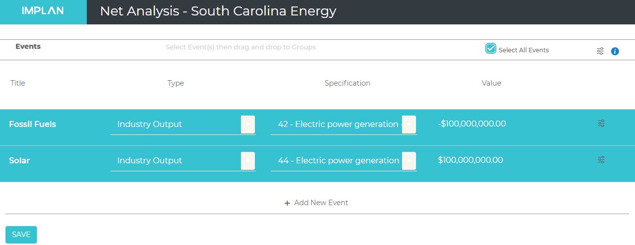
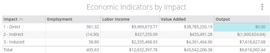
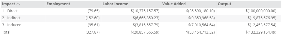
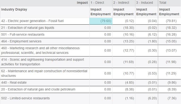
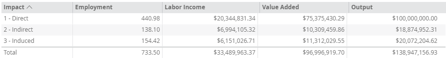
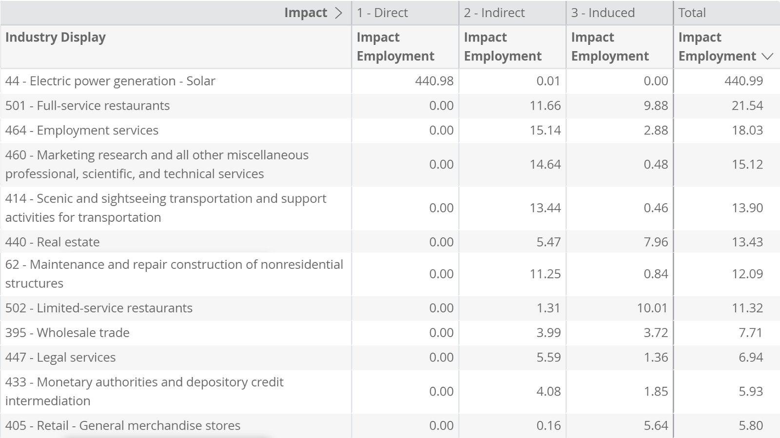
 Featured image: The RESULTS Screen
 Fig. 1
 Fig. 2
 Fig. 2.a
 Fig. 3
 Fig. 3.a
 Fig. 4
 Fig. 5
 Fig. 5.a
 Fig. 5.b
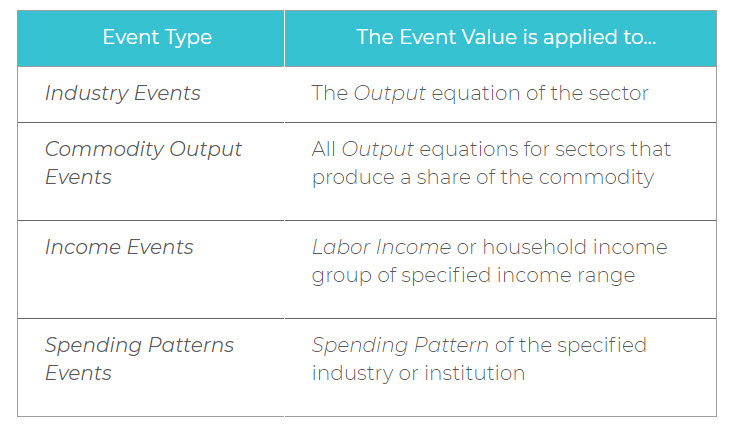
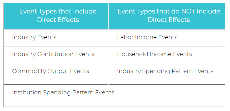
 Featured image: the PROJECTS screen
 Fig. 1
 Fig. 2
 Fig. 3
 Fig. 4
 Fig. 5
 Fig. 5.a
 Fig. 6
 Fig. 6.1
 Fig. 6.2
 Fig. 6.3
 Fig. 6.4
 Fig. 6.5
 Fig. 6.5.a
 Fig. 7
 Fig. 8
 Fig. 9
 Fig. 10
 Fig. 10.a
 Featured image: the RESULTS screen
 Fig. 1
 Fig. 2
 Fig. 3
 Fig. 4
 Fig. 4.a
 Fig. 5
 Fig. 5.1
 Fig. 5.2
 Fig. 5.2.a
 Fig. 5.3
 Fig. 5.3.a
 Fig. 5.4
 Fig. 5.4.a
 Fig. 5.5
 Fig. 5.5.a
 Fig. 5.6
 Fig. 5.7
 Fig. 5.7.a
 Fig. 5.7.b
 Fig. 6
 Fig. 6.1
 6.1.a
6.1.a Fig. 6.2
 Fig. 6.3
 Fig. 6.3.a
 Fig. 6.4
 Fig. 6.5
 Fig. 6.5.a
 Fig. 6.5.b
 Fig. 7
 Fig. 7.1
 7.1.a
7.1.a Fig. 7.2
 Fig. 7.3
 Fig. 7.3.a
 Fig. 7.3.b
 Fig. 8
 Fig. 8.1
 Fig. 8.1.a
 Fig. 8.2
 Fig. 8.2.a
 Fig. 8.3
 Fig. 8.3.a
 Fig. 8.4
 Fig. 8.4.a
 Fig. 8.5
 Fig. 8.6
 Fig. 8.6.a
 Fig. 8.6.b
 Fig. 9
 Fig. 9.1
 Fig. 9.2
 Fig. 9.3
 Fig. 9.4
 Fig. 9.5
 Fig. 9.6
 Fig. 9.7
 Fig. 9.7.a
 Fig. 9.7.b
 Fig. 10
 Fig. 11
 Fig. 12
 Fig. 12.a
 Featured image: The IMPACTS Screen
 Fig. 1
 Fig. 2
 Fig. 3
 Fig. 4
 Fig. 4.a
 Fig. 5
 Fig. 5.1
 Fig. 5.1.a
 Fig. 5.1.1
 Fig. 5.1.2
 Fig. 5.1.2.a
 Fig. 5.1.3
 Fig. 5.1.3.a
 Fig. 5.1.4
 Fig. 5.1.5
 Fig. 5.1.5.a
 Fig. 5.1.5.b
 Fig. 5.2
 Fig. 6
 Fig. 6.1
 Fig. 6.2
 Fig. 6.2.1
 Fig. 6.2.2
 Fig. 6.2.3
 Fig. 6.2.3.a
 Fig. 6.2.4
 Fig. 6.2.4.a
 Fig. 6.2.5
 Fig. 6.2.5.a
 Fig. 6.2.6
 Fig. 6.2.6.a
 Fig. 7
 Fig. 8
 Fig. 9
 Fig. 9.a
 Featured image: The REGIONS Screen
 Fig. 1
 Fig. 2
 Fig. 3
 Fig. 4
 Fig. 4.a
 Fig. 5
 Fig. 5.a
 Fig. 5.b
 Fig. 6
 Fig. 6.a
 Fig. 7
 Fig. 7.a
 Fig. 8
 Fig. 8.1
 Fig. 8.1.b
 Fig. 8.1.c
 Fig. 8.2
 Fig. 9
 Fig. 9.1
 Fig. 10
 Fig. 11
 Fig. 12
 Fig. 12.a
 Featured image: The IMPLAN Dashboard
 Fig. 1
 Fig. 2
 Fig. 3
 Fig. 4
 Fig. 5
 Fig. 6
 Fig. 7
 Fig. 8
 Fig. 9
 Fig. 10
 Fig. 10.a
 Featured image: The Change Password Screen
 Fig. 1
 Fig. 1.a
 Fig. 2
 Fig. 3
 Fig. 3.a
 Fig. 4
 Fig. 4.a
 Fig. 5
 Fig. 5.a
 Fig. 6
 Fig. 7
 Fig. 8
 Fig. 8.a
 Fig. 9
 Fig. 10
 Fig. 10.a
 Featured image: The IMPACTS Screen
 Fig. 1
 Fig. 1.a
 Fig. 2
 Fig. 3
 Fig. 4
 Fig. 5
 Fig. 5.a
 Fig. 5.b
 Fig. 5.c